

Introduction: UX So Good, You Don’t Even Know It’s There!
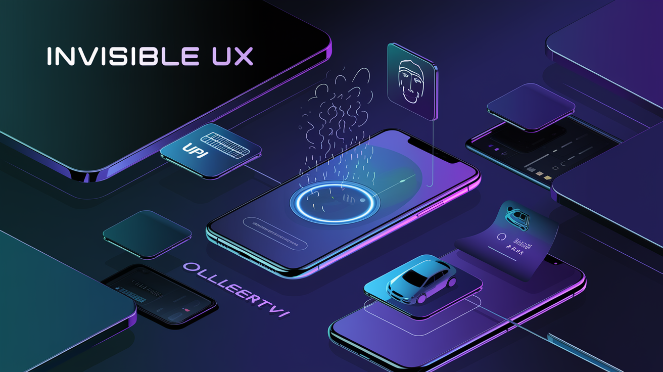
Ever booked an Uber and reached your destination without thinking about the app? Or unlocked your iPhone with Face ID without noticing how smooth it was? That, my friend, is the magic of Invisible UX.
Invisible UX (User Experience) is when an app, website, or product works so seamlessly that you don’t even realize you’re using it. The moment you notice User experience, it means something’s gone wrong—maybe an error message popped up, the button was too small to tap, or the page loaded slower than an IRCTC booking on Tatkal hour.
So, let’s deep-dive into:
- What is Invisible UX?
- How top brands (Apple, Google, Uber) master it?
- What mistakes kill a smooth user experience?
- How YOU can design invisible User experience ?
If you’re a designer, developer, or just someone who enjoys effortless digital experiences, this is for you. Let’s get started with adwebcraft.! 🚀
What is Invisible UX? The Magic of Effortless Design
It is like waiters in a fancy restaurant—you only notice them when they mess up.
Invisible UX means that the experience is so natural and frictionless that users don’t even think about the design. Everything just… works.
Invisible User experience in Action
- WhatsApp’s One-Tap Voice Messages – Hold to record, release to send. Simple.
- Google’s Search Bar – No instructions needed; you just start typing.
- Amazon’s “Buy Now” Button – One tap, done. No unnecessary forms.
Example :
Remember when you had to enter a 16-digit debit card number every time you made an online payment? Now, thanks to UPI (Unified Payments Interface), you just tap, enter a PIN, and boom! Payment done. (If your country doesn’t have UPI, well.. India does.) That’s Invisible UX.
The Science Behind Why the Best UX is “Invisible”
Great UX designers follow one golden rule: Reduce Cognitive Load.
Cognitive Load in User experience ? Yeh Kya Hai?
Cognitive load is the mental effort required to use a system. The higher the cognitive load, the more frustrating the experience.
How to Reduce Cognitive Load?
- Minimize Steps – Like UPI, where you just enter a PIN instead of filling out long forms.
- Predict User Needs – Google autofill knows what you’re searching for before you finish typing.
- Avoid Information Overload – Ever opened a government website? So much clutter, it feels like an engineering college exam paper!
Example: Swiggy and Zomato save your last-used address and payment method. This removes unnecessary steps, letting you order in seconds.
Real-World Examples: Brands That Nailed Invisible UX
Some brands just get UX right. Let’s look at some legendary Invisible UX examples.
1. Google Pay (UPI)
- No need to enter account details.
- Just tap the contact and pay!
2. Apple’s Face ID
- No PINs, no passwords. Just look at the phone, and it unlocks.
3. Uber’s One-Tap Rides
- Open the app → One tap → Driver arrives. No need to explain “Bhaiya, left lena.”
How Apple, Google & Uber Use Invisible User experience Without You Noticing
1. Apple – The King of Invisible UX
- No extra buttons. Minimalist design.
- AirPods Auto Connect. No need to pair manually.
- MacBook Trackpad Gestures. No one reads the manual; yet, everyone knows how to use it.
2. Google – The Mind-Reader
- Google Assistant understands Indian accents. No need to sound like an NRI.
- Google Maps auto-corrects route mistakes. Missed a turn? Maps doesn’t shout, “Abe ullu !” It just recalculates.
3. Uber – Tap and Forget
- Knows your frequent locations. No need to type every time.
- Automatically detects ride type (Go, Auto, Premier).
The Role of Minimalism in User experience: Less is More
A cluttered UI is like a Delhi market during Diwali—too much happening, and you don’t know where to look.
Why Minimalism Wins in UX?
- Fewer Distractions – Focus on what matters.
- Faster Load Times – Fewer elements = Faster app.
- Easier Navigation – If users have to “find” a button, you’ve already failed.
Example from India: CRED’s app design is super clean. No extra buttons, no pop-ups. Just rewards & payments.
Micro-interactions: The Unsung Heroes of Invisible UX
Ever noticed how your phone slightly vibrates when you unlock it? Or how a red dot appears on WhatsApp when there’s an unread message? These are microinteractions, tiny design elements that enhance the user experience without them even realizing it.
Think of them as the salt in your biryani—you don’t consciously notice them, but if they weren’t there, something would feel… off.
What Are Microinteractions in User experience?:-
Microinteractions are small, subtle design elements that provide feedback, improve usability, and make digital experiences smoother and more intuitive.
Examples of Microinteractions in User experience
- Instagram’s “Like” Animation – When you double-tap, the heart pops, giving instant visual feedback.
- Swipe-to-Delete on iPhone – Feels effortless because of the smooth transition animation.
- Twitter’s Pull-to-Refresh – The small bounce effect makes waiting feel less annoying.
Example from India: Swiggy & Zomato’s loading screens. Instead of a boring “Loading…” message, they show funny food-related quotes like “Your biryani is getting a royal treatment” or “Chopping onions, wiping tears.” These keep users engaged while they wait.
Why Are Microinteractions So Powerful?
- They provide instant feedback. (Like when the “Submit” button turns green after entering correct details)
- They make apps more engaging. (A subtle vibration when you delete something)
- They guide users subtly. (Greyed-out “Next” buttons until all fields are filled)
How to Use Microinteractions for Invisible UX?
- Use animations that feel natural. (Avoid flashy, distracting effects)
- Keep feedback subtle but noticeable. (Like a progress bar while uploading a file)
- Make actions feel rewarding. (A small sound effect when payment is successful)
Moral of the story: The best microinteractions are felt, not noticed!
How AI and Automation Make UX Feel Natural
AI is slowly turning it into “just do it for me” mode. The best apps today don’t wait for users to input everything manually; they predict needs and automate processes for a frictionless experience.
How AI Enhances UX Without Users Noticing
- Auto-Fill Forms: Google Chrome remembers your details, reducing cognitive load.
- Smart Replies in Gmail: Google suggests quick responses, saving time.
- Face ID Unlock: No need for PINs—just look at your phone, and boom, it’s open.
Examples of AI-Powered UX
- Jio’s AI Voice Assistant: Allows users to recharge their mobile number hands-free.
- Google Pay (UPI Auto-Pay): No need to approve payments every month—UPI Auto-Pay handles it.
- Ola’s Ride Prediction: Remembers frequently traveled routes and suggests them automatically.
Best Practices for AI in User experience Design
- Make automation optional. Not everyone likes AI predicting their actions.
- Ensure user control. Users should always have the ability to edit AI-suggested actions.
- Keep AI interactions human-like. A robotic voice assistant will drive people crazy!
Moral of the story: The best AI-powered User experience makes life easier, not creepier.
Here’s something about how and what to do in UI/UX in terms of web development, with tools, roles, concepts, everything, check it out NOW.!
Common UX Mistakes That Kill the Invisible Experience
Sometimes, designers try too hard to be fancy and end up making terrible decisions. Here are the biggest blunders in creating user experience that can ruin the invisible experience.
The Biggest UX Mistakes That Frustrate Users
1. Too Many Pop-Ups & Notifications
- Every app thinks its notification is life-changing. But if your app spams users like a clingy ex, they will uninstall it.
- Example: Ever visited a website that instantly asks, “Allow Notifications?” before you even read a word? Annoying!
2. Complicated Navigation
- If a user has to “find” the login button, your app has already failed UX.
- Example: Indian government websites. Enough said.
3. Slow Loading Speeds
- If your app takes longer to load than a Delhi Metro at peak hours, users will leave.
- Example: IRCTC’s Tatkal Booking—where 30 seconds can determine your entire vacation.
How to Avoid UX Mistakes?
- Keep navigation simple. If a user has to think, you’ve already lost them.
- Reduce unnecessary steps. UPI payments removed OTPs for small transactions, making it frictionless.
- Test your app with real users. Because what seems obvious to a designer might confuse a user.
Moral of the story: If your UX makes users work too hard, they’ll leave!
How to Design Invisible UX: Best Practices for Designers
If you’re a designer, you might be thinking:
“Okay, Invisible UX sounds great, but how do I actually design it?”
Here are the golden best practices for designing seamless UX experiences.
The “Golden Rules” of Invisible UX
1. Reduce Steps Wherever Possible
- Ask yourself: “Can this task be done in fewer steps?”
- Example: Amazon’s “Buy Now” button eliminates checkout friction.
2. Predict User Behavior
- If your app can guess what the user wants before they ask, you’re winning.
- Example: YouTube Autoplay—it just knows you’ll watch 10 more videos.
3. Make Interactions Effortless
- If a user has to consciously think about how to do something, UX has failed.
- Example: Apple’s AirDrop—no setup needed, just send files instantly.
4. Test, Test, and Test Again!
- What makes sense to a designer may confuse users.
- Example: Ever seen a “Swipe to Unlock” screen? That was tested a million times before launch.
Moral of the story: The best UX designs feel so obvious, you don’t even notice them.
AdWebCraft: The UX Experts Making Seamless Experiences
Thinking of building an app or website and want it to feel effortless and natural?
That’s where adwebcraft comes in!
Why Choose adwebcraft for UX Design?
- Minimalist, smooth UX that users love.
- AI-driven automation for effortless interactions.
- Faster, optimized, and frictionless digital experiences.
Whether you’re designing an app, e-commerce site, or a SaaS platform, our team ensures that your UX is invisible (in the best way possible!).
Want to create seamless experiences? Let’s make it happen!
Conclusion: If UX Feels Effortless, You’ve Done It Right!
Invisible UX = Best UX
- Users don’t have to think.
- Everything just works.
- They keep using your app because it’s frictionless.
If you’re a designer, developer, or business owner, your goal should be to remove all barriers between the user and their goal.
So next time you enjoy a seamless experience, ask yourself:
“Why does this feel so easy?” That’s Invisible UX at work.