

“Bhai, ek mast magazine design bana do!” – Every client ever.
“Bas sab kuch daal do, space mat chhodo!” – Also, every client ever.
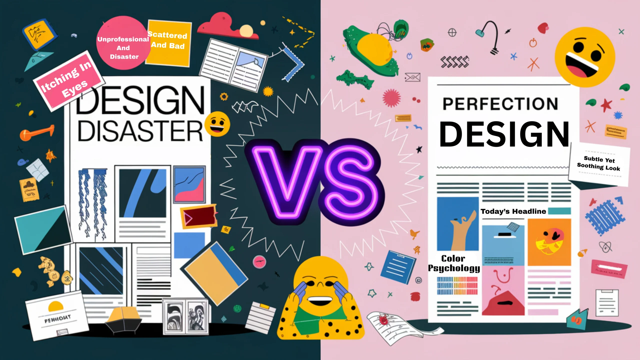
If you’ve ever seen a flyer, magazine, or brochure that made your eyes hurt, congratulations—you’ve witnessed bad publication design in its full glory.
A well-designed publication is like a well-made biryani—balanced, flavorful, and aesthetically satisfying. But bad publication design? That’s like biryani with ketchup.
From terrible font choices to design chaos that looks like a digital Diwali mela, today we’re diving deep into the biggest publication design mistakes and why they make designers want to switch careers to goat farming.
And don’t worry, if you recognize any of these errors in your own work, adwebcraft is here to save your brand from looking like an MS Paint experiment.
Introduction: Why Bad Publication Design Hurts Your Brand?
Imagine you’re opening a real estate magazine to check out some luxury apartments. You expect clean layouts, premium fonts, and stunning visuals, right?
But instead, you see:
- Comic Sans in bright red
- Blurry images of the apartment (that look like they were taken on a Nokia 3310)
- 10 different fonts fighting for attention
- A contact number hidden in a chaotic mess of text
Would you trust this builder? Of course not! Here, 10 Essential Principles of Publication Design.!
Your publication is your brand’s first impression. If it looks unprofessional, your audience will assume your business is unprofessional too.
- A great publication design makes your brand look credible, high-quality, and trustworthy.
- A bad publication design makes your brand look like it belongs on a WhatsApp forward.
Let’s uncover the biggest design crimes and how to avoid them!
Typography Mistakes: The Crimes Against Letters!
Typography is like Bollywood actors—some work well together, while others create a disaster when paired. (Looking at you, Sajid Khan films!)
Using the wrong fonts can make even the best content look unprofessional. Here’s what NOT to do:
Mistake : Using Too Many Fonts
Some designers think more fonts = more creativity. Nope! It’s more fonts = a ransom note!
Example:
Imagine reading an event invitation where the title is in Times New Roman, the details in Arial, the tagline in Comic Sans, and the RSVP section in Papyrus.
It’s like watching a family WhatsApp group—no coordination, just chaos!
Fix: Stick to two or three fonts maximum—one for headings, one for body text, and one for highlights.
The Chaos of Using Too Many Fonts!
Using multiple fonts is like mixing chai with coffee—just because you like both doesn’t mean they should be in the same cup.
The golden rule? Stick to a theme.
Common Font Mistakes:
-
Mixing script fonts with bold, modern sans-serifs (feels like a formal wedding invite with a Comic-Con flyer).
-
Using fancy, unreadable fonts for important details (Looking at you, calligraphic fonts in restaurant menus!).
-
Choosing a typeface just because it “looks cool” without checking readability.
Pro Tip: Google Fonts and Adobe Fonts have great pre-made font pairings that work well together!
Alignment Issues: When Text Looks Like a Drunk SMS!
Picture this: You’re reading an advertisement where each line is randomly aligned—left, center, right, center, left. Your brain will work harder than a student in an engineering exam just to follow the flow!
Example: Imagine a restaurant menu where each item is randomly placed on the page. “Paneer Tikka” is aligned to the left, “Chicken Biryani” is centered, and “Masala Dosa” is somewhere in between. Total confusion!
Fix: Stick to a consistent alignment—left-aligned for readability, center-aligned for emphasis.
Bad Kerning: When Letters Look Like They Are Social Distancing!
Kerning is the space between letters. When it’s too wide, words look like they’re scared of each other. When it’s too tight, letters blend into an unreadable mess.
Real-World Example:
A restaurant printed “MEGA DISCOUNTS” but due to bad kerning, it looked like “ME GADIS COUNTS”. (A very confusing offer for car owners!)
Fix: Always check kerning and spacing before finalizing designs.
Overuse of Stock Images: That “Seen It Before” Look!
Stock images are helpful, but when overused, they make your publication look generic.
Example:
-
A corporate brochure using the same smiling “business handshake” image that appears in every other company’s flyer.
-
A college prospectus featuring too many overly happy students. (Nobody is that happy during exams!)
Fix: Use authentic, custom photography or at least modify stock images to align with your brand.
Ignoring White Space: When Design Feels Claustrophobic!
White space is not wasted space—it helps guide the reader’s eyes smoothly.
Common Mistakes:
-
Cramming too much text and images into one page (Like a WhatsApp forward full of emojis).
-
No breathing room between sections (Imagine a menu where all dishes are listed with no gaps!).
Fix: Add padding around text, leave gaps between sections, and let the design breathe!
Color Clashes That Hurt the Eyes!
Color theory matters! Red text on a blue background? Painful. Bright yellow on white? Invisible.
Real-World Example:
Ever seen a political poster with text in red, blue, yellow, and green? Exactly.
Fix: Follow the 60-30-10 rule—60% primary color, 30% secondary, 10% accent.
Low-Resolution Images: The Blurry Disaster!
Pixelated images = unprofessional design.
Example:
A restaurant menu with blurry food images. Instead of making you hungry, it makes you question the hygiene standards.
Fix: Use high-resolution (300 DPI) images for print.
Misaligned Margins: The Invisible But Deadly Mistake!
Ever seen a magazine where the text is cut off at the edges? That’s bad margin planning.
Fix: Keep a minimum 5mm margin on all sides!
Unreadable Text: When Contrast Goes Wrong!
Light yellow text on white? NO.
Gray text on black? Meh.
Fix: Dark text on light backgrounds (or vice versa) = best readability!
Publication Design Done Right: The Key Elements of a Professional Layout!
A good publication design should have:
- Consistent font pairings
- Proper margins and spacing
- High-quality images
- Balanced colors
How AdWebCraft Can Save You From These Design Disasters!
At adwebcraft, we create stunning publication designs that:
- Grab attention & boost credibility
- Follow the latest design trends
- Make sure you NEVER use Comic Sans (Promise!)
Conclusion: Don’t Let Your Publication Look Like a Bad Meme!
Your publication design represents your brand. Make it clean, professional, and visually appealing!
Need a design upgrade? Contact adwebcraft—where creativity meets perfection! 🚀